
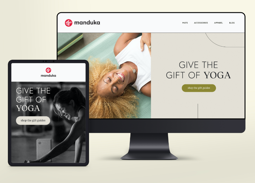
The team at Manduka came to us as an already well-established and go-to yoga brand but having trouble with communicating their story. Seeking to evolve their brand's positioning and creative presence, all while keeping the sacred Manduka frog mark, we worked to capture and define this through strategy, identity, and so much more.


Logo Refresh
To keep with the elevated visual story, a new custom word mark was introduced that nods to the refreshed typography system.
The recognizable sub mark remains intact.

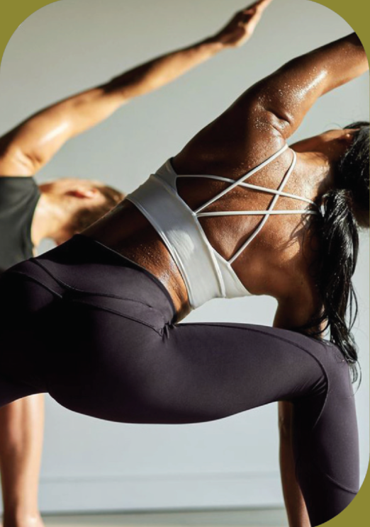
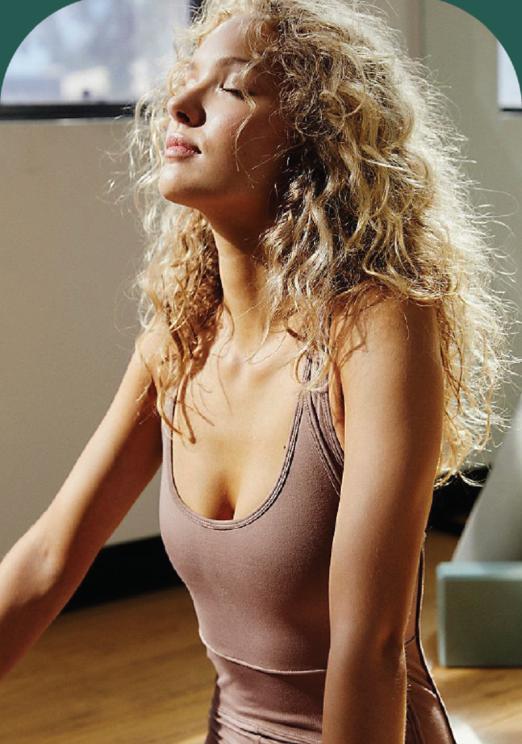


Yoga has a look. We set out to change that by recommending Manduka approaches their ethos in a truly inclusive, bold and approachable way. By inspiring everyone to find their balance and realize their own potential through the practice of yoga, we established a through line that could carry its way into the brand's visual identity.


Thank you for reaching out!
We will be in touch shortly.